Logos | Colours | Typefaces | Image library
MILLENNIUM TECHNOLOGY PRIZE MATERIAL BANK
—
external | updated 12.5.2021 (at 08:54)
The files found here on this page can be used for the sole purpose of communicating Millennium Technology Prize events. Editing the Illustrator, After Effects, Indesign and Photoshop files requires an active subsrciption of Adobe CC. Using the Microsoft files requires an applicable Microsoft 365 subscription. In case you have any questions, please don’t hesitate to contact the persons listed in the footer of this page.
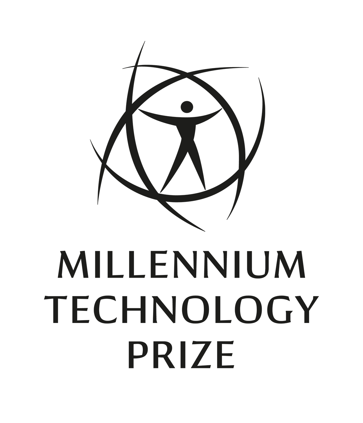
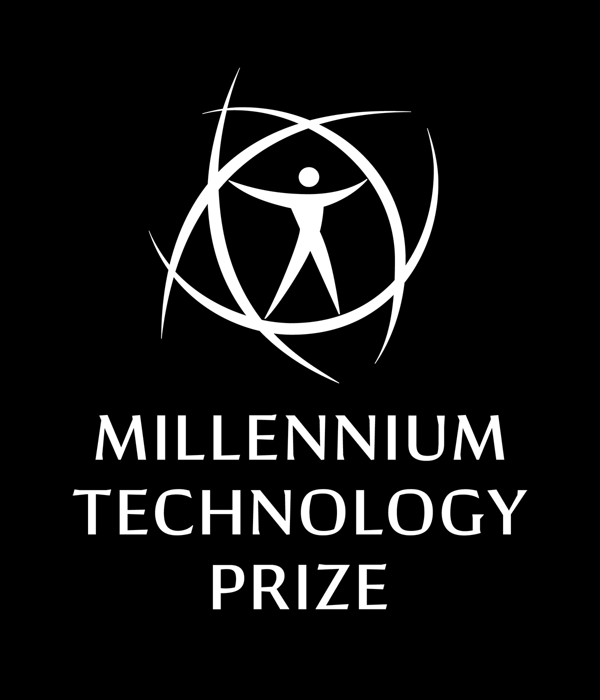
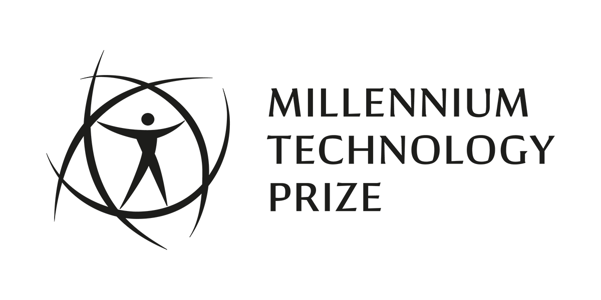
LOGOS
—
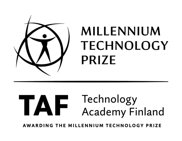
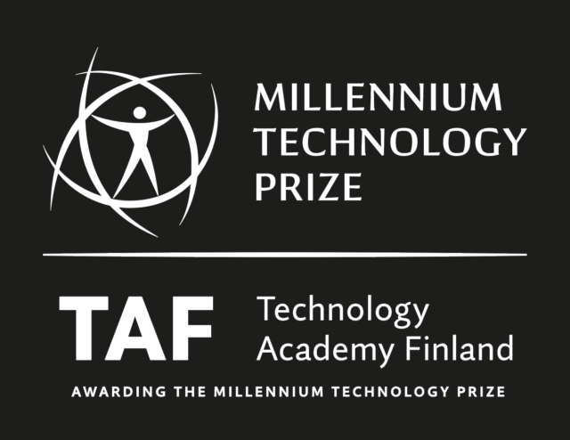
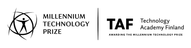
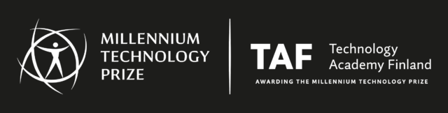
all the logo files have a transparent background. The symbol — a human form surrounded with four arches — has been designed by Ari Tenhunen in 2003. For the communications after 2021 the logotype will be typeset with Conglomerate Medium and additional texts with Quire Sans Regular (eg. “Millennium Innovation Forum”). You can download the logo files here:
—
you can download Millennium Innovation Forum logos as Adobe Illustrator CC 2021 files with editable texts down below (activate the necessary typeface Quire Sans here):

—
you can download Millennium Technology Prize with Technology Academy Finland logos with slogan ”Awarding the Millennium Technology Prize) down below:
—
you can download Millennium Technology Prize with Technology Academy Finland logos with down below:
—
you can download Technology Academy Finland logos down below:
COLOURS
—
you can download all the Millennium colours here as a Adobe CC library. Open any Adobe CC application and import the unzipped file to your Library window. Different color systems (Pantone, cmyk, rgb, hex) are in folders, named accordingly. You can watch a video tutorial on importing and exporting Adobe CC Libraries. Yearly color sets can be downloaded here as Illustrator and InDesign (CC 2021) documents: Palette A, Palette B, Palette C, Palette D & Palette E.
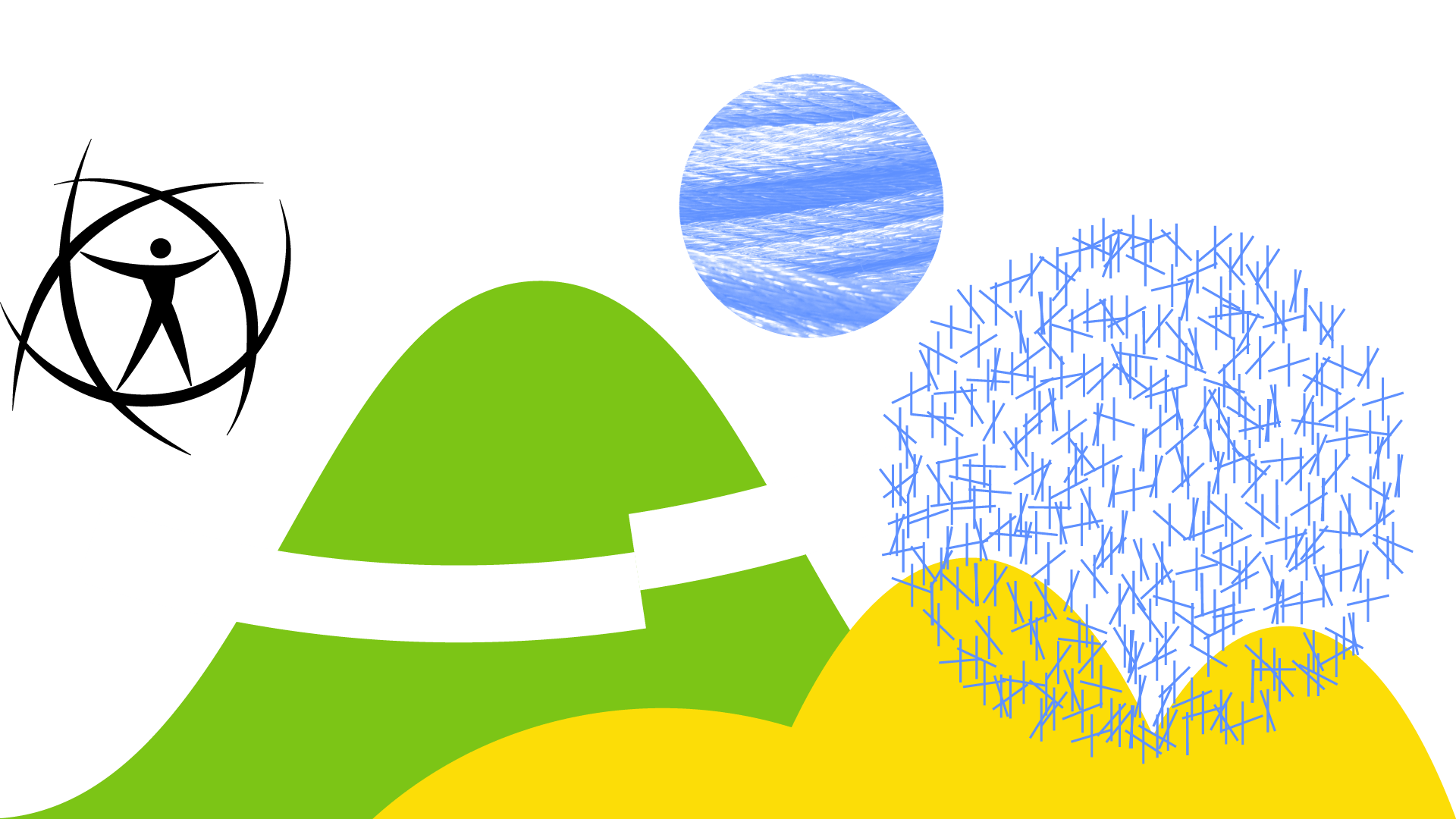
These are the main colours of the visual identity for 2021–2030:
Joy
Pantone 109
C0, M5, Y100, K0
R252, G221, B7
#fcdd07
Fairness
Pantone 368
C54, M0, Y100, K0
R124, G197, B22
#7cc516
Celebration
Pantone 2381
C63, M34, Y0, K0
R94, G144, B255
#5e90ff
If you need to create large coloured surfaces, please prefer these pastel tones instead:
Optimism
Pantone 9121*
C2, M0, Y30, K0
R255, G248, P199
#fff8c7
Sustainability
Pantone 2281
C13, M0, Y48, K0
R217, G246, B177
#d9f6b1
Purity
Pantone 9460*
C22, M0, Y8, K0
R232, G253, B255
#e8fdff
These muted tones are good for printing text in small scale, or when creating a somber ambience:
Terrain
Pantone 7757
C31, M34, Y82, K52
R77, G68, B0
#4d4400
Forest
Pantone 553
C77, M28, Y74, K67
R25, G77, B0
#194d00
Ocean
Pantone 2147
C100, M85, Y0, K30
R2, G32, B118
#001f76
Sometimes you just need few extra colours – these two neutral tones will work well with all of the colours mentioned above:
Neutrality, Equality and Balance
Pantone Cool Gray 1
C10, M7, Y5, K0
R232, G232, B232
#e8e8e8
Sky
Pantone 2387
C91, M60, Y0, K0
R2, G102, B208
#0266d0
Pantone colours can be found in a PANTONE® Formula Guide and on the Pantone website. Colours 9121 and 9460 can be found in PANTONE® Pastels & Neons.
TYPEFACES
—
the typefaces used in the visual identity are from Adobe. You can use them on a website, with a valid Adobe CC license. This material bank page has been typeset by using these two fonts.
The typeface used in the logo is Conglomerate. It is also good for short large titles, statements and diplomas. This typeface should always be used in capital letters.
All other texts should be typeset with Quire Sans. This is good e.g. for subtitles, body texts, bulleted texts.
When using either of the Typekit fonts is not possible, please use Google Fonts typeface Noto Sans for all texts. It is free to use. The font is good for Microsoft Office Apps. This typeface has a good support for multiple languages – so you can typeset non Latin texts using this typeface. The typeface is also in Adobe Typekit and it has been used for Japanese lettering in the brochure template.
For situations you need to use simultaneously two languages, the typographic difference should be created with using italics for the secondary language. This applies to all typefaces. Example: if the primary language is english and you’re using Quire Sans Regular for those texts, the secondary language (e.g. Finnish) should be typeset with Quire Sans Regular Italic. Highlight should be done with bolder cuts of the same typeface. In case you need to use italics in your primary language, please make the highlight for the secondary language using the regular cut, without the italic.
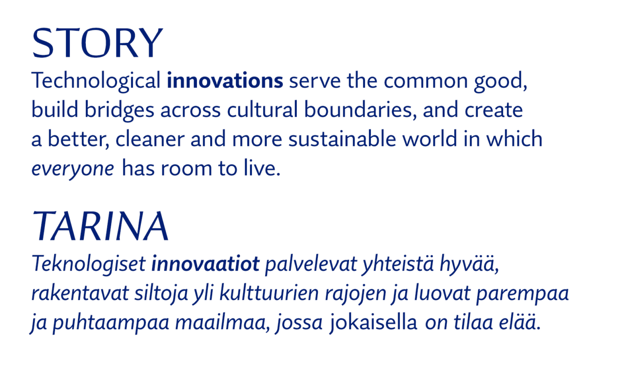
IMAGE LIBRARY
—
images can be downloaded from our GoogleDrive Image library. The file name contains all the information you need: the description and the photo credits.
Permission to use the materials may be requested from Minna Zaknoun, +358 40 747 3035 / Technology Academy Finland. Copyright holders have been mentioned when applicable. If you have questions about the information or files found on this page, please don’t hesitate to contact Pekka Piippo, +358 40 512 3836 / Studio Pekka Piippo Oy.
materialbank.millenniumprize.org